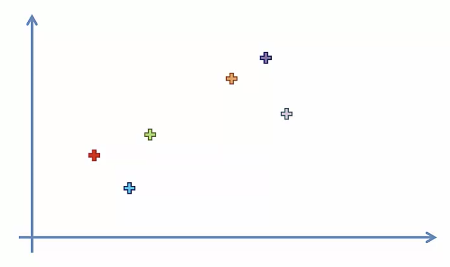
Hierarchical clustering algorithms group similar objects into groups called clusters. There are two types of hierarchical clustering algorithms:
- Agglomerative — Bottom up approach. Start with many small clusters and merge them together to create bigger clusters.
- Divisive — Top down approach. Start with a single cluster than break it up into smaller clusters.

Some pros and cons of Hierarchical Clustering
Pros
- No assumption of a particular number of clusters (i.e. k-means)
- May correspond to meaningful taxonomies
Cons
- Once a decision is made to combine two clusters, it can’t be undone
- Too slow for large data sets, O(𝑛2 log(𝑛))
How it works
- Make each data point a cluster

2. Take the two closest clusters and make them one cluster

3. Repeat step 2 until there is only one cluster

Dendrograms
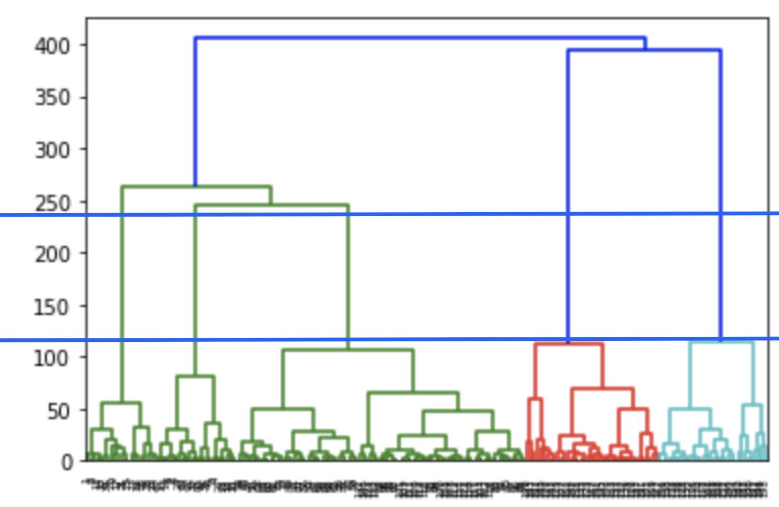
We can use a dendrogram to visualize the history of groupings and figure out the optimal number of clusters.
- Determine the largest vertical distance that doesn’t intersect any of the other clusters
- Draw a horizontal line at both extremities
- The optimal number of clusters is equal to the number of vertical lines going through the horizontal line
For eg., in the below case, best choice for no. of clusters will be 4.

Linkage Criteria
Similar to gradient descent, you can tweak certain parameters to get drastically different results.

The linkage criteria refers to how the distance between clusters is calculated.

Single Linkage
The distance between two clusters is the shortest distance between two points in each cluster

Complete Linkage
The distance between two clusters is the longest distance between two points in each cluster

Average Linkage
The distance between clusters is the average distance between each point in one cluster to every point in other cluster

Ward Linkage
The distance between clusters is the sum of squared differences within all clusters

Distance Metric
The method you use to calculate the distance between data points will affect the end result.
Euclidean Distance
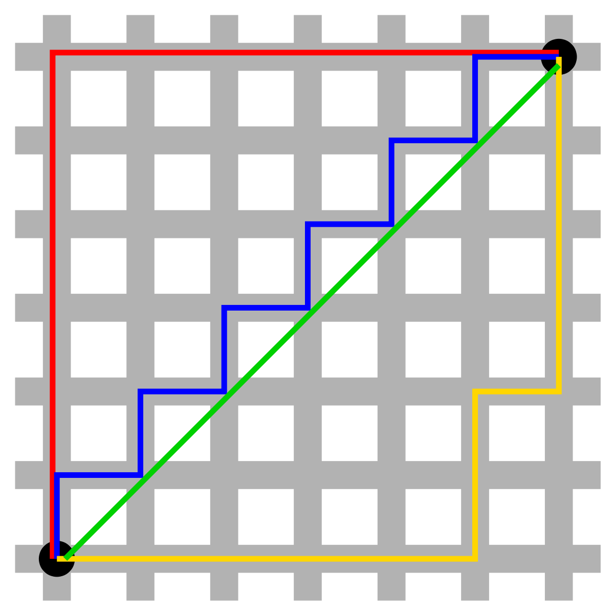
The shortest distance between two points. For example, if x=(a,b) and y=(c,d), the Euclidean distance between x and y is √(a−c)²+(b−d)²

Manhattan Distance
Imagine you were in the downtown center of a big city and you wanted to get from point A to point B. You wouldn’t be able to cut across buildings, rather you’d have to make your way by walking along the various streets. For example, if x=(a,b) and y=(c,d), the Manhattan distance between x and y is |a−c|+|b−d|

Example in python
Let’s take a look at a concrete example of how we could go about labelling data using hierarchical agglomerative clustering.
import pandas as pd
import numpy as np
from matplotlib import pyplot as plt
from sklearn.cluster import AgglomerativeClustering
import scipy.cluster.hierarchy as sch
In this tutorial, we use the csv file containing a list of customers with their gender, age, annual income and spending score.

If you want to follow along, you can get the dataset from the superdatascience website.
To display our data on a graph at a later point, we can only take two variables (annual income and spending score).
dataset = pd.read_csv('./data.csv')

X = dataset.iloc[:, [3, 4]].values
Looking at the dendrogram, the highest vertical distance that doesn’t intersect with any clusters is the middle green one. Given that 5 vertical lines cross the threshold, the optimal number of clusters is 5.
dendrogram = sch.dendrogram(sch.linkage(X, method='ward'))
We create an instance of AgglomerativeClustering using the euclidean distance as the measure of distance between points and ward linkage to calculate the proximity of clusters.
model = AgglomerativeClustering(n_clusters=5, affinity='euclidean', linkage='ward')
model.fit(X)
labels = model.labels_
The labels_ property returns an array of integers where the values correspond to the distinct categories.

We can use a shorthand notation to display all the samples belonging to a category as a specific color.
plt.scatter(X[labels==0, 0], X[labels==0, 1], s=50, marker='o', color='red')
plt.scatter(X[labels==1, 0], X[labels==1, 1], s=50, marker='o', color='blue')
plt.scatter(X[labels==2, 0], X[labels==2, 1], s=50, marker='o', color='green')
plt.scatter(X[labels==3, 0], X[labels==3, 1], s=50, marker='o', color='purple')
plt.scatter(X[labels==4, 0], X[labels==4, 1], s=50, marker='o', color='orange')
plt.show()


No comments:
Post a Comment